 Knott.js Documentation
This project is in the development stage.
Thanks for support and feedback!


Web Component, Virtual CSS and Virtual DOM.
Introduction
Knott is a tiny 1.5 kilobytes (minified + gzipped) virtual DOM and virtual CSS library for building and styling fast, lightweight web components that everything runs on the memory, it's fast!
Getting Started
$ npm i knott --save-dev
Create an empty template to learn how to use Knott.js with CLI (command-line interface). Without installing anything to setup a new project. After the installation, follow the on-screen instructions and you are done setup.
$ npx knott-cli@latest my-new-knott-project
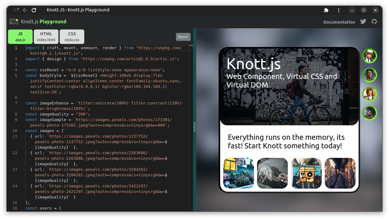
Playground
The Playground is an online code editor, you can use it for testing or just playing around with Knott.js on the go. If you don't find the CLI is more convenient.
Launch Playground now!
Usage
- Press F1 to open Palette menu to access advanced options.
- Press Reset button to delete data stored in the browser.
Create Element
Use craft() to create virtual nodes commonly everywhere in the project. It takes a selector as a new element, props as attributes, text as string to put on the document, html to add custom non-virtual-node element, optional actions as an event listener, tasks as custom function calls, and expands the array of children elements in the same node with expand: [...]. Read more details below.
// app.js
import { craft } from "knott";
//import { craft } from "https://unpkg.com/knott@0.2.0/knott.js";

const newComponent = (props) =>
  craft(
    selector, {
      // attributes
      props {
        id: "",
        class: "",
        style: "",
        // any...
      },
      // options
      text: "TEXT",
      html: `<p></p>`,
      data: [ { a: "1" }, { a: "2" } ],
      keys: ["A","B"],
      actions: [
        [action, event, ()=>{ f() }],
      ],
      tasks: [ f() ],
      expand: [
        slotComponent,
        customFunction,
        craft(),
        // and so on...
      ],
    }
  );
2
3
4
5
6
7
8
9
10
11
12
13
14
15
16
17
18
19
20
21
22
23
24
25
26
27
28
29
30
31
| Keys | Params | Descriptions |
|---|---|---|
| selector | String | create new element (e.g. <div>, <p>), or semantically elements (e.g. <profile-image>, <profile-avatar/>). |
| props | List | create any attributes (e.g. alt="", src="") as properties to an element. |
| expand | List [...] | create child elements with craft() in a parent element (e.g. <div><p><a></a></p></div>) or includes other slotComponent created with craft() or customFunction calls when component is loaded. |
| text | String | create string content to an element (e.g. <p>Text</p>). |
| html | String | create first-render HTML element to an element, but text content will be disabled. |
| keys | List [...] | iterate objects in a JSON array append on an element from data objects. |
| data | Object [...] | add an array JSON object to an element. Use keys to select which object to iterate. |
| actions | List [...] | create event listener to an element to call function(s) when clicked or onload. |
| tasks | List [...] | add on-demand function(s) call when the component is loaded. |
| vdom | Boolean | set true to display virtual node objects in console. |
| slotComponent | function | import component file by using import {...} from "...";. |
| customFunction | function | import custom function calls. |
Create basic component with inline CSS properties.
// Example #1
craft("div", props: { style:"color:red" }, text: "Welcome!");
2
// Example #2
craft("top-header-container", html: `<div class="...">Welcome!</div>`);
2
Create a component with children element within a parent element with expand:.
craft("div", // parent
  text: "Parent",
  expand: [ // children
    craft("div", {
      text: "Children",
    }),
  ]
);
2
3
4
5
6
7
8
Virtual Node
An virtual node with element is rendered into actual document to display on browser is using render() and mounted with mount() as component taken one element ID.
Example 1: Recommended writting.
// Example #1
// app.js
import { craft, mount, render } from "knott";

const vNode = () =>
  craft("div", {
    props { style: "color:white" },
    text: "This is Text!",
  });

// render as...
// <div class="..." style="...">...</div>
mount("app", render(vNode()));
2
3
4
5
6
7
8
9
10
11
12
13
Example 2: Shorthand writing.
// Example #2
// app.js
import { craft, mount, render } from "knott";

// render as...
// <div class="..." style="...">...</div>
mount("app", render(
  craft("div", {
    props { class: "color:white" },
    text: "This is Text!",
  });
));
2
3
4
5
6
7
8
9
10
11
12
Example 3: The
html:is treated as a single object acting as an injection for the parent element.
// Example #3
// app.js
import { craft, mount, render } from "knott";

// render as <div><p>Text</p></div>
mount("app", render(
  craft("div", {
    html: `<p>Text</p>`,
  });
));
2
3
4
5
6
7
8
9
10
Create Component
Create a new component named largeCard and export with the same example largeCard name.
// component-a.js
import { craft } from "knott";

const largeCard = () =>
   craft("div", {
    text: "Large Card",
  });

export { largeCard };
2
3
4
5
6
7
8
9
Import Component
Import component files as a module and reuse them anywhere in the project.
// app.js
import { craft, mount, render } from "knott";
import { largeCard } from "component-a"; // as module.

mount("root", render(
  craft("body", {
    props: { id: "root" },
    expand: [
      largeCard, // imported component as child element in <body id="root">
    ],
  })
));
2
3
4
5
6
7
8
9
10
11
12
Component Properties
Extend more options (or props) of a reusable component.
// component
const newComponent = (
  // props
  newId,
  newStyle,
  newContent
) =>
  // element
  craft("div", {
    props: { // attributes
      id: newId,
      class: newStyle,
    },
    // options
    text: newContent,
  });
2
3
4
5
6
7
8
9
10
11
12
13
14
15
16
Event Listener
| Keys | Modes | Events | Calls |
|---|---|---|---|
| actions | add, remove, addWindow, removeWindow | https://developer.mozilla.org/en-US/docs/Web/Events | Function |
// component.js
import { craft } from "knott";

const alertButton = () =>
  craft("div", {
    text: "Click Me!",
    actions: [
      ["add", "click", () => { ... }],
      ["addWindow", "click", () => { ... }],
      ["remove", "click", () => { f() }],
      ["removeWindow", "click", () => { ... }],
    ],
  });

export { alertButton };
2
3
4
5
6
7
8
9
10
11
12
13
14
15
Mount Component
| Functions | Descriptions |
|---|---|
mount("id", render(vNode)); | deliver real (DOM) elements on the page visible on browser viewport. Note: Virtual node has to be mounted with a target element Id (e.g <div id="root"></div> or <body id="root"></body>). |
An example to display additional component by using mount() when a text clicked with click handler actions:[...].
// component.js
import { craft, mount, render } from "knott";

const panelA = () =>
  craft("div", {
    props: { id: "idPanelA" },
    text: "This is Panel A. Click Me!",
    actions: [
      ["add", "click", () => { // or
        mount("idPanelA", render(panelB));
      }],
    ],
    tasks: [ // or
      mount("idPanelA", render(panelB))
    ],
  });

// to be added
const panelB = () =>
  craft("div", {
    text: "Panel B is appeared!",
  });

export { panelA };
2
3
4
5
6
7
8
9
10
11
12
13
14
15
16
17
18
19
20
21
22
23
24
UnMount Component
| Functions | Descriptions |
|---|---|
unmount("id"); | remove (DOM) element from the page invisible on browser viewport. |
An example is to remove the component or element node from DOM with unmount().Extend more options of a reusable component.
// component.js
import { craft, mount, unmount, render } from "knott";

const panelA = () =>
   craft("div", {
    text: "Click Me to remove Panel B",
    actions: [ // or
      ["add", "click", () => {
        unmount("idPanelB");
      }],
    ],
    tasks: [ // or
      unmount("idPanelB");
    ],
    expand: [
      // to be removed
      craft(
        "div", {
          props: { id: "idPanelB", }, // <= target
          text: "Panel B!",
        }
      );
    ],
  });

export { panelA };
2
3
4
5
6
7
8
9
10
11
12
13
14
15
16
17
18
19
20
21
22
23
24
25
26
Data Binding
// Example #1
// component.js
const css = "font-weight:bold";
const text = "Welcome to Knott JS!";

const newCard = (css, text) =>
  craft("div", {
    props: { style: css },
    text: text,
  });
2
3
4
5
6
7
8
9
10
// Example #2
// component.js
const css = "font-weight:bold";
const text = "Knott JS!";

const newCard = (css, text) =>
  craft("div", {
    props: { style: `classA classB classC ${css}` },
    text: `Welcome to ${text}`,
  });
2
3
4
5
6
7
8
9
10
// Example #3
// component.js
const css = "font-weight:bold";
const text = "Knott JS!";

const newCard = (css, text) =>
  craft("div", {
    html: `
      <div style=${css}>
        ${text}
      </div>
    `,
  });
2
3
4
5
6
7
8
9
10
11
12
13
Iteration
| Keys | Params | Descriptions |
|---|---|---|
| actions | [[mode, event, function]] | create an event listener to an element to call function(s) when clicked or onload. |
// component.js
const images = [
  { url: "https://example.com/example-one.png" },
  { url: "https://example.com/example-two.png" },
];

const logos = () =>
  craft("partner-logos", {
    actions: [
      ["addWindow", "load", () => {
        images.forEach((item) => {
          const l = document.createElement("div");
          l.innerHTML = `<img src="${item.url}" alt="" loading="lazy" />`;
          document.querySelector("partner-logos").appendChild(l);
        });
        //...
      }],
    ]
  });
2
3
4
5
6
7
8
9
10
11
12
13
14
15
16
17
18
19
Routing
Knott.js keeps the routing as simple as possible, just a basic alias in between the path (page url), page title (or page id), and template component. Use router() without refreshing pages, page loading almost instantly.
| Function | Params | Descriptions |
|---|---|---|
| route() | path | url (e.g. "/", "/about", "/food/breads") |
template | page id or page title | |
controller | template page function call (e.g. "/#/about") |
Example #1: Basic how to use the router.
// Example #1
// app.js
import { route, router } from "knott";

const homePage = () => craft("div", { text: "Home Page" });

route("/", "Home", homePage);

router(); // init
2
3
4
5
6
7
8
9
Example #2: Write more elegantly, organize pages with objects.
// Example #2
// app.js
import { route, router } from "knott";

import { homePage } from "./home";
import { fruitsPage, breadsPage } from "./foods";

const pages = [ // example.com/#/fruits
  { path: "/", title: "Home", template: homePage },
  { path: "/fruits", title: "Fruits", template: fruitsPage },
  { path: "/breads", title: "Breads", template: breadsPage },
];

pages.forEach((alias) => {
  route(
    alias.path,
    alias.title,
    alias.template,
  );
});

// init
router();
2
3
4
5
6
7
8
9
10
11
12
13
14
15
16
17
18
19
20
21
22
23
Show / Hide Component
Use dedicated helper toggleById(), toggleBySelector(), toggleByIdSelector to create basic show/hide element with Event Listener.
| functions | params | description |
|---|---|---|
| toggleById() | id, classlist[...] | target effect element by id |
| toggleBySelector() | selector, classlist[...] | target effect element by selector |
| toggleByIdSelector() | id, selector, classlist[...] | target effect element by id and selector |
// Example #1
// component.js
import { craft, design } from "knott";
import { toggleById } from "knott";

const newButton = () =>
  craft("button", {
    text: "Click Me!",
    actions: [
      ["add", "click", () => {
        toggleById("modal", [
          "display:block",
        ]);
      }]
    ],
  });

const newModal = () =>
  craft("div", {
    props: { id: "modal", class: "display:none" },
    text: "This is a Modal",
  });

design(true);
2
3
4
5
6
7
8
9
10
11
12
13
14
15
16
17
18
19
20
21
22
23
24
// Example #2
// component.js
import { craft, design } from "knott";
import { toggleBySelector } from "knott";

const newButton = () =>
  craft("button", {
    text: "Click Me!",
    actions: [
      ["add", "click", () => {
        toggleById("new-modal", [
          "display:block",
        ]);
      }]
    ],
  });

const newModal = () =>
  craft("new-modal", {
    props: { id: "modal", class: "display:none" },
    text: "This is a Modal",
  });

design(true);
2
3
4
5
6
7
8
9
10
11
12
13
14
15
16
17
18
19
20
21
22
23
24
Hover Effect
Use dedicated helper toggleById(), toggleBySelector(), toggleByIdSelector to create basic hover effect with Event Listener.
| functions | params | description |
|---|---|---|
| toggleById() | id, classlist[...] | target effect element by id |
| toggleBySelector() | selector, classlist[...] | target effect element by selector |
| toggleByIdSelector() | id, selector, classlist[...] | target effect element by id and selector |
// Example #1
// component.js
import { toggleById, design } from "knott";

const newButton = () =>
  craft("button", {
    props: { id: "thisButton" },
    text: "Hover Me!",
    actions: [
      ["add", "mouseover", () => {
        toggleById("thisButton", [
          "opacity:0.5"
        ]);
      }],
      ["add", "mouseout", () => {
        toggleById("thisButton", [
          "opacity:1"
        ]);
      }]
    ],
  });

design(true);
2
3
4
5
6
7
8
9
10
11
12
13
14
15
16
17
18
19
20
21
22
23
Styling
Introducing the Virtual CSS with Artis.

Note:
style()has removed from Knott since v0.1.8 and refactored to a separated new project called the Artis, the Virtual CSS library.Artis.jssyntax is very different from it's predecessorstyle().
Artis also has bundled into Knott as external module to use as internal module.
// Example #1
// app.js
import { design } from "knott";

window.onload = () => design(true); // init artis.js
2
3
4
5
To install Artis separately,
// Example #1
$ npm install artis@latest --save-dev
2
// Example #2
// app.js
import { design } from "artis";
//import { design } from "https://unpkg.com/artis@1.0.9/artis.js";

window.onload = () => design(true); // init artis.js
2
3
4
5
6
Please read the Artis Documentation. Or get your hand dirty and try out at Artis Playground for more virtual goodness.
Or, if you need a more robust design tool to create responsible user interface, introducing the low-level CSS framework, Weavv CSS.

To install Weavv CSS seperately,
// Example #1
$ npm install weavvcss@latest --save-dev
2
// Example #2
// app.js
import "weavvcss";
2
3
If you curious about project Weavv CSS, try at the Playground without setup anything.
Service Worker
Enable Persistent Caching service worker to store app assets in browser for offline access.
Import cache() module from knott and set parameter to true.
// Example #1
// app.js
import { cache } from "knott";

// init
cache(true); // should execute after the `mount()`
2
3
4
5
6
Create a new separate file named sw.js at the root of the project directory and, add below lines. Edit CacheName and CacheAssets to suit your need.
// {root_directory}/sw.js
const cacheName = "knott-app-cache-version";

const cacheAssets = [
  "/",
  "/index.html",
  "/assets/app.js",
  "/assets/app.css",
];
2
3
4
5
6
7
8
9
10
Thanks for reading.